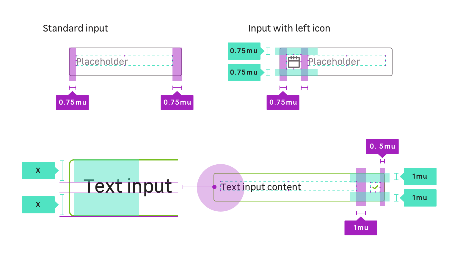
Anatomy
Medium
Small
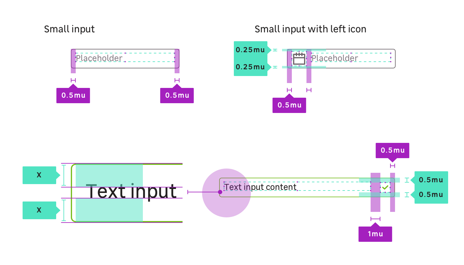
Properties
CSS Tokens : layout / sizes
| Size name | Paddings | Font-size | Line-height | radius |
|---|---|---|---|---|
| Small | 8px (mu050) | size.font.04 (14px) | size.line.04.l (22px) | radius.m (4px) |
| Medium (Default size) | 12px (mu075) | size.font.05 (16px) | size.line.05.l (24px) | radius.m (4px) |
CSS Tokens : state colors
You must always use the tokens, the colors are only there for that information.
| State | Property | Token | Color |
|---|---|---|---|
| Default | background | color.input.background | #ffffff |
| Default | border-color | color.input.border | #6f676c |
| Default | color | color.input.text | #222020 |
| Hover | border-color | color.input.hover.border | #222020 |
| Focus | border-color | color.input.focus.border | #25a8d0 |
| Valid | border-color | color.input.valid.border | #78be20 |
| Valid & Hover | border-color | color.input.valid.hover.border | #0a601b |
| Invalid | border-color | color.input.invalid.border | #df382b |
| Invalid & Hover | border-color | color.input.invalid.hover.border | #641b21 |
| Disabled | background | color.input.disabled.background | #eeeef0 |
| Disabled | border-color | color.input.disabled.border | #a19ba2 |
When disabled, an input field can never display any other state styles, and should not respond to any user interaction other than showing the related disabled cursor when user is overing.
Viewport: px
<div class="example"> <input type="text" class="mc-text-input" disabled placeholder="Disabled" name="example" /></div>Supported input types
textemaildatepasswordnumbertelnumbersearch
Note that if you try to apply those CSS classes to an unsupported input type. It could work but you should find something which better suits to your needs in the documentation.